Cellador Ales
Cellador Ales is a Los Angeles-based wild ales brewery known for their experimental flavors, unique brewing methods and impeccable taste.
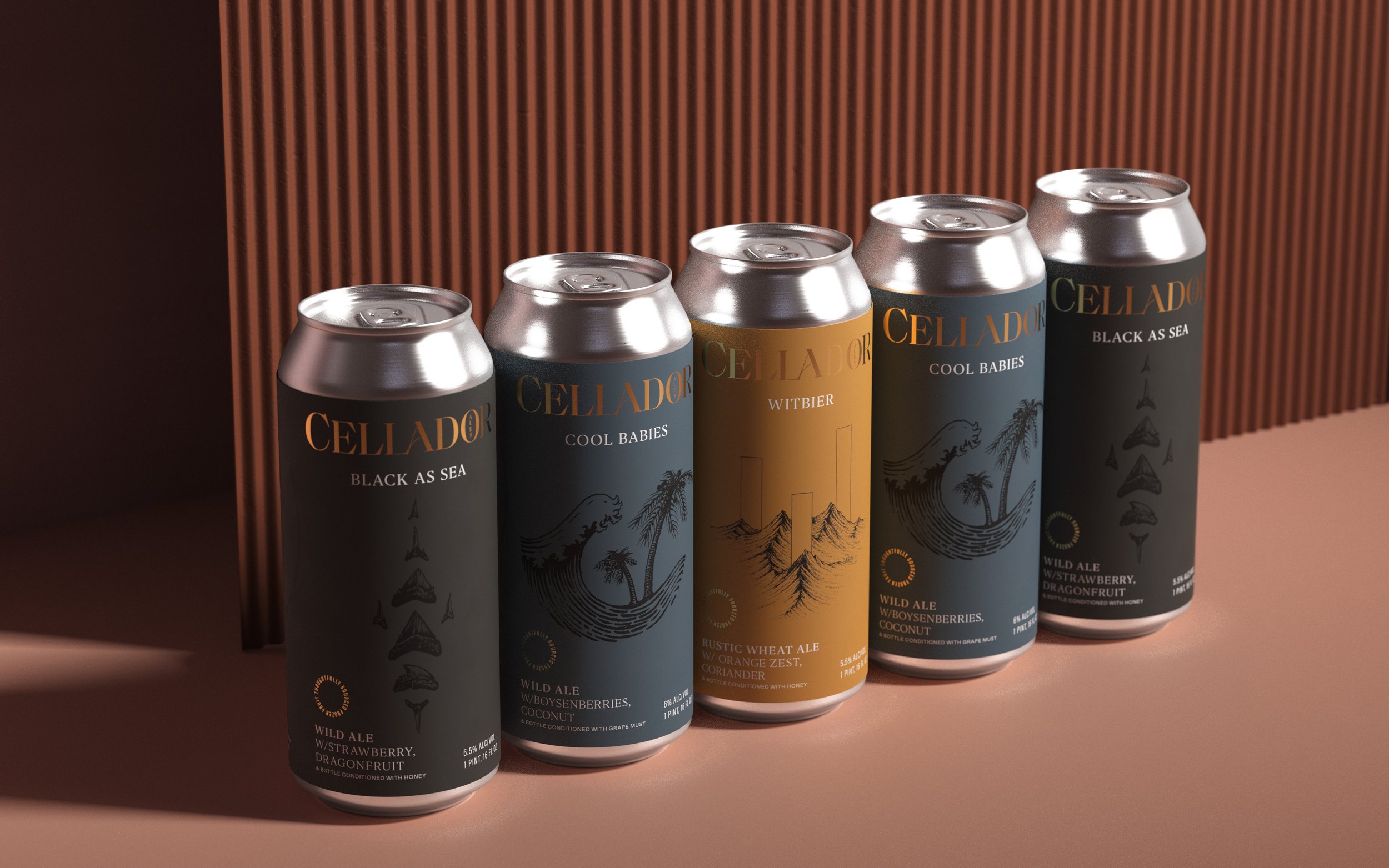
Cellador came to us looking for a rebrand that would better communicate their brand values and product quality.
Logo
Packaging
Visual Identity
Swag
Menu
Photography


Packaging Design
Year-Round Releases
Due to the experimental nature of Cellador, there are many beers released only one time but within their offerings are always beers that can be found several times a year every year. The label design for this line of beers call back to their more cocktail-inspired foundations by giving a multilayered, detailed look that makes the entire circumference of the bottle fun to read.


Packaging Design
Collaborations
Two-three times a year Cellador will collaborate with another brewery for an exciting, one-time release. To make these releases more recognizable on shelf and online, we developed a lable that would highlight the collaborative nature of the brew and allow Cellador to showcase artwork that worked for both brands in a compelling and show-stopping way.


Packaging Design
For Lovers of Literature
A few times a year Cellador will lean on a saying from a song or poem to give a theme to one of thier special releases. This year was tribute to the folk song that gave them the idea for their name. We created a type-focused solution to celebrate.


TEAM